Applying explainable AI methods to lung disease
What is Pneumonia?
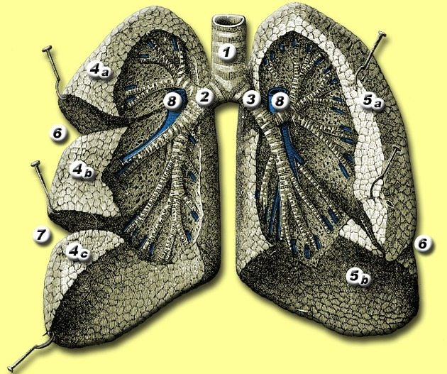
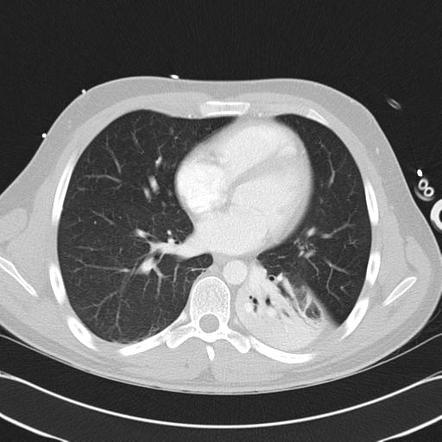
Pneumonia is a common infection, with increased popularity after COVID-19 (pneumonia caused by a SARS-CoV-2 virus). But before we can go more in-depth into the investigation of pneumonia, it is worth understanding more about the lungs. We can see parts of the lungs in the picture above (the left lung — on the right — is smaller due to the presence of the heart).
The definition of pneumonia is as follows:
Infection within the lung. Results in infected fluid and pus filling the alveolar spaces.
This means infected fluids start at the bronchus (2 and 3 in the picture) and advance to the pulmonary arteries (8 in the image above).
The diagnosis pipeline for pneumonia looks like this:
- Blood test: check-raised white blood cell count and inflammatory markers
- Chest X-ray — characteristics described in the next section
- Chest CT scan — characteristics similar to an X-ray
In this article, we will automate diagnosis for step 2, as with COVID-19, a lot of labeled data became openly available, and the number of skilled radiologists is limited. To follow along more easily, check the accompanying Jupyter Notebook.
Chest X-Rays — Pneumonia or Not Pneumonia?
Below are examples of two healthy lungs and two lungs with pneumonia. The lungs with pneumonia have clear white smoke on them, which indicates air spaces and infective fluids.
Dataset Creation and Training
For this article, we are using a combination of three datasets:
- Open dataset of COVID-19 cases with chest X-rays– consisting of mixed examples of viral and bacterial pneumonia.
- Paul Mooney’s dataset — consisting of examples of both viral and bacterial pneumonia separated.
- COVID-19 Radiography dataset– Kaggle’s high-quality dataset with different classes (including COVID, viral pneumonia, and lung opacity).
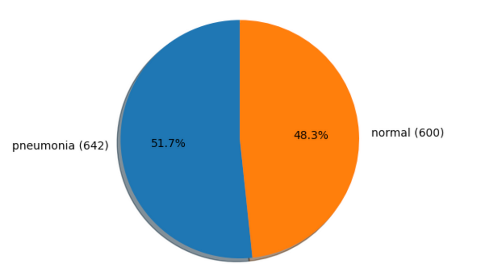
In the case of the medical domain, pictures are always limited, so it is crucial to be clever and resourceful with what you have. Additionally, the dataset is often imbalanced, so for the sake of our dataset, we only use a fraction of “normal” (healthy) examples.
The proportion for our dataset is visible on the graphic below:
For the training purpose, we use the ImageNet pre-trained Resnet-18 model and the train-val split of 80–20. Additionally, we use an Adam optimiser and not-so-casual Cosine Anealing Learning Rate as it is advised to train powerful models fast. Additionally, we use casual data augmentations like resizing, random cropping, and flipping to add more robustness.
Finally, we use unused examples from the “COVID-19 Radiography dataset” for the test set.
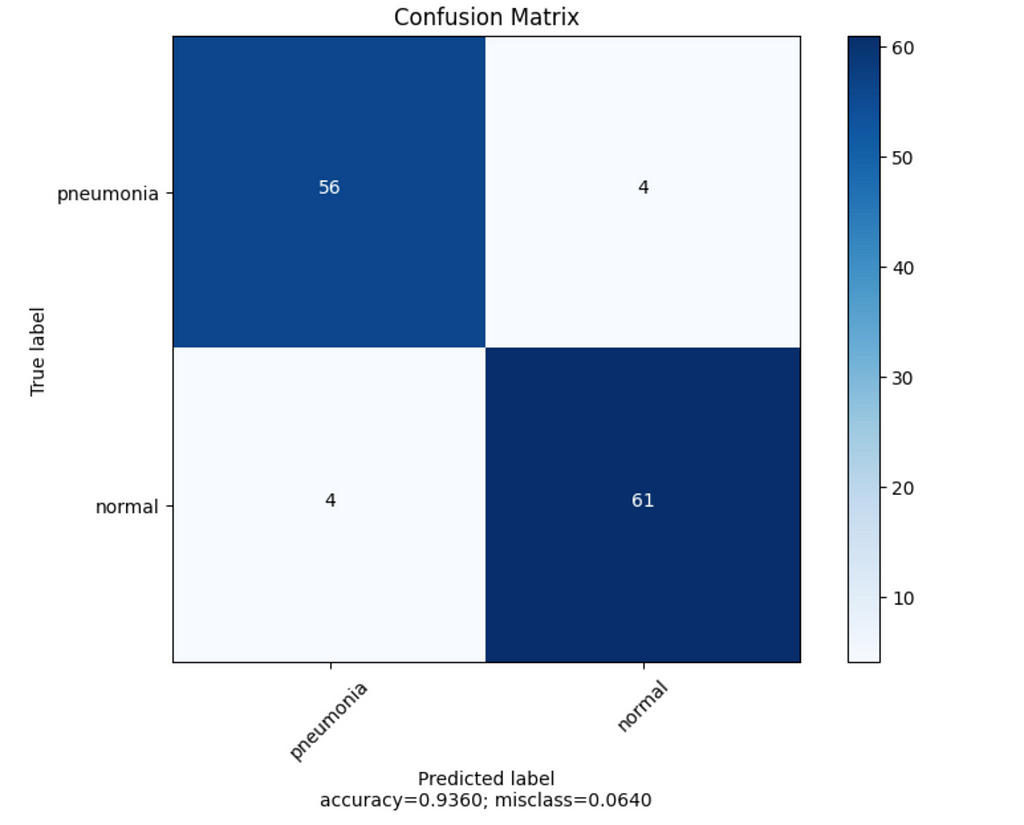
Results: We got about 93–94 % for the test and validation sets, which seems quite decent. When we observe confusion matrices, we still sometimes have false positives and negatives, so let’s observe some examples and provide explanations from FoXAI.
Explanations Analysis
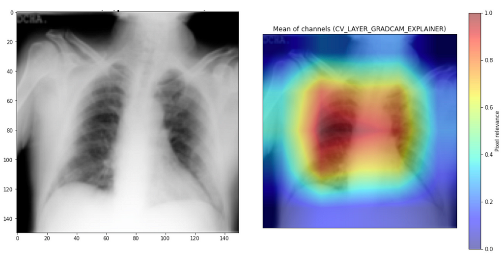
With explanation analysis, we want to get our confidence in good explanations where the model correctly focuses on the right part of the picture. Additionally, we can identify some biases and artefacts in data which might pollute the model reasoning and result in worse performance and strange behaviour.
To better understand the model’s behaviour, we use the GradCam algorithm from the ReasonField Lab library called FoXAI.
To install it, you can use the following command:
pip install foxai
And for explanations, explanation generation and visualisation look as follows:
with FoXaiExplainer(
            model=model,
            explainers=[ExplainerWithParams(explainer_name=Explainers.CV_LAYER_GRADCAM_EXPLAINER, layer=layer),],
            target=label,
        ) as xai_model:
            # calculate attributes for every explainer
            probs, attributes_dict = xai_model(input_data)
            for key, value in attributes_dict.items():

                # create figure from attributes and original image
                figure = mean_channels_visualization(attributions=value[0], transformed_img=sample, title= f"Mean of channels ({key})")

                imshow(sample, (8,8), title=title)
                show_figure(figure)
Having all that, we can now move to the analysis of exciting examples.
Good Examples
Let’s start with good examples. We can see that model focuses on both lungs for “normal” examples and more on the smoky area for pneumonia examples. So it seems it is working great, right?

Bad Examples
General Errors of Label
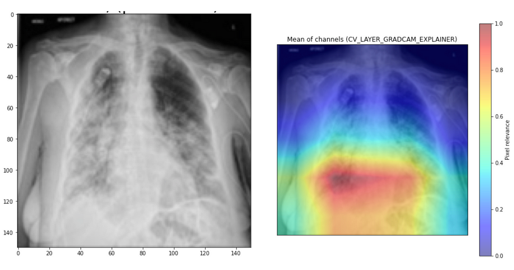
Well, it is not always great. When we analyse samples when the model is wrong, we can find many peculiarities. For the first example, it wrongly assigns the normal label while focusing on the smoky area of the lung, which indicates airspaces often happen with pneumonia.
The other example is even more severe. Even a non-expert would notice a lot of crazy things in the lung, but the model gives the label “normal,” even when focusing on the part of the lung with quite an advanced stage of illness. Even with 90+% accuracy, we get this kind of peculiarity.

Focus Outside of the Picture
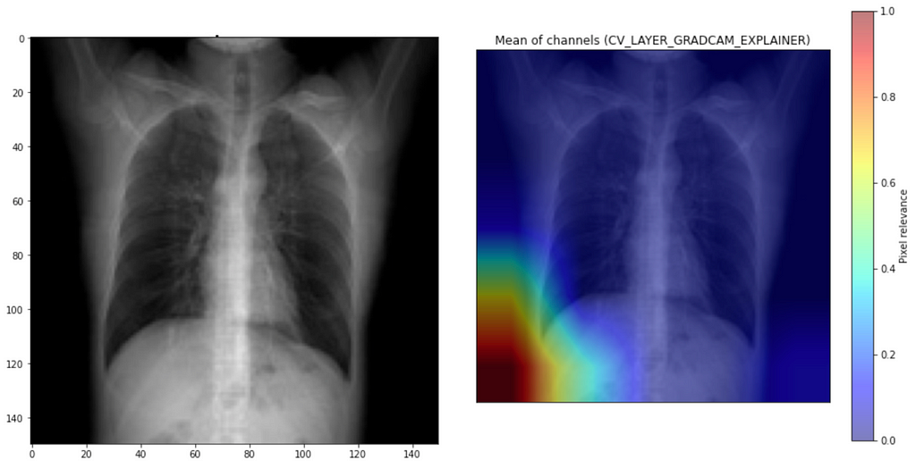
I also noticed that for some examples, it focuses outside of the scope of interest, as in the example below. This explanation indicates that as the model focuses on the wrong part of the picture, it must give a better prediction.
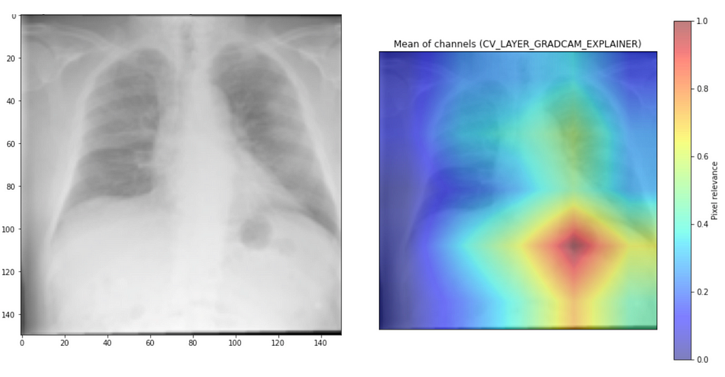
Another example proves that it is only sometimes the case when the model disagrees and perhaps has low confidence it focuses on the wrong part. For this example, it goes to extra length to focus on the lower part of the left lobe, while viral “smokes” are seen across the upper lobes and the right lung.
Focus on Letters
The last peculiarity I noticed was the focus on the letter “L.” It is common for radiologists to put these letters on the picture to better understand where left and right is. Even if it helps to orient the picture, it should not be the most discriminative feature to which the model decides whether it is pneumonia.

Problems With X-ray Pictures
As you have noticed by now, pictures from X-rays vary a lot, and there is no one way of making pictures. X-ray pictures are sensitive to the machine- and picture-specific settings. This can be seen in some pictures, as you have a human body clearly of darker colour, while in some, we have it significantly more white and blurry. There is no clear standardisation between hospitals. For the untrained eye, the same person can have one picture at Hospital A while completely different at Hospital B.
Human-specific characteristics also play a massive role in the picture. The level of fat tissue plays a considerable role in how the XRay looks. Age also affects the look as it is much more straightforward to see lungs for a child than for an older person. Older people also might have loose skin, which may produce reflexes, which could be mistakenly labelled as some form of lung disease. Overlapping soft tissues may cause quite some confusion in this area.
Patients after operations are less standard examples. Even skilled radiologists often need a proper background check for a particular patient, as there may be misleading shades or unwanted lines.
After training models for this article, I noticed that data diversity is of utmost importance. I started with a combination of the first two datasets ( Open dataset of COVID-19 and Paul Mooney’s dataset) and tested on the third one (COVID-19 Radiography dataset), which resulted in high accuracy (97+% accuracy) within the training and validation set, while coin-flip like results on the test set. After some investigation, I noticed that pictures differ between datasets, so it was much harder to learn generalisable features.
Solutions
To create an AI system that can assist radiologists end-to-end, we should consider doing the following:
- Further analyses with radiologists to clean and expand the dataset.
- Try to better understand the risk of false negatives and positives and address it via proper means like class balancing, results preprocessing, or weighted loss function.
- Add other modalities like patient history, which influence radiologists’ decisions.
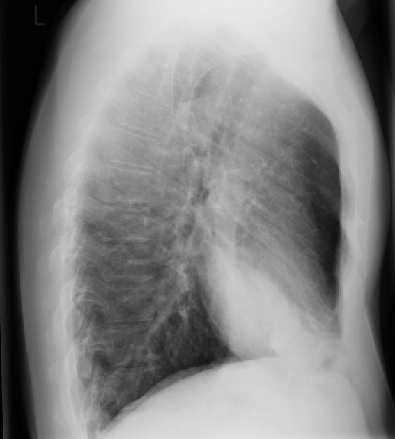
- Add other steps like lateral XRay picture or CTScan.
This list is not exhaustive but should be treated more as directions worth considering.
Conclusion
In this article, we learned about applying deep learning to the medical domain, pneumonia and how it can be seen, how problematic XRay pictures are, and most importantly, how to use FoXAI to understand our model mistakes better.
If interested in the topic, check the accompanying notebook to understand further the subject and how FoXAI can be used to analyse explanations.
Originally published at https://www.reasonfieldlab.com.
FoXAI for Pneumonia was originally published in Better Programming on Medium, where people are continuing the conversation by highlighting and responding to this story.