An introduction to the 3D Hexagon and its React wrapper
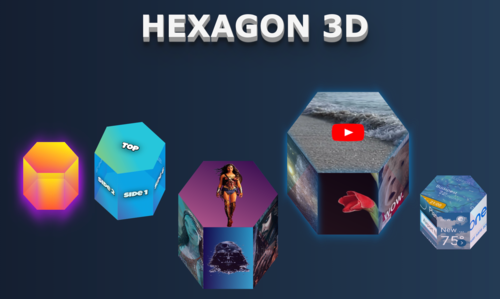
We all are tired of boring enterprise projects where all web parts consist of React (Angular, Vue, whatever) forms, standard components, and state managers. Let’s bring some fun into our development life and build something non-trivial that can be used to build a fun web page or interactive service. Let me introduce the 3D Hexagon module and its React wrapper!
Concept
We all like geometrical shapes and interact with them all the time on the web and in real life. The most common 2D ones are rectangles and circles, and cubes and spheres from the 3D world. But what if we want to present something more complex on our site?
Then the range of available libraries/packages/ready solutions drastically decreases, and finding something good becomes challenging. I want to make this gap a bit smaller, so I built a tiny module that builds 3D hexagons using pure CSS and a React component wrapper to represent its graphical part (however, you can do it on your own with plain HTML if needed. An example will follow). These hexagons can encapsulate various HTML blocks (like text, images, and videos) and can interact independently with their sides. This makes these shapes useful for various purposes.
You may check the following NPM packages: hexagon-3d and hexagon-3d-react
Implementation
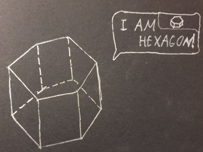
Since we’re talking about geometrical shapes, let’s start with some math, which helps us build a 3D hexagon. Hexagon is a six-angled shape with all sides of equal length. 3D hexagon consists of eight independent parts, with the top and bottom 2D hexagons and six rectangles as its shape sides.
Since we are building our hexagon via CSS, we technically will have eight HTML divs. Each will represent a hexagonal 2D face. All faces are originally placed in 2D, and our concept will shift them into the right position, then rotate around the x- and z-axes into the pseudo-3D CSS space. For this, we need to write several equations.
The size of our hexagon is determined by the width parameter, which will be passed by the user (default value set to 70). For naming purposes, let’s rename our hexagon’s width to small height:
smallHeight = width;
The hexagon diameter (or the distance between the furthest points of a hexagon), let’s call it height2d, can be determined as:
height2D = width / cos(30);
or
height2D = width * 1.1547;
Finally, the side length of the hexagon (sideLength) is just:
sideLength = height2D / 2;
To summarize, we need three constants to do all necessary shifts:
const height2D = width * 1.1547;
const sideLength = height2D / 2;
const smallHeight = width;
Important: we must assume our hexagon can dynamically change height in one of two directions: to the top or to the bottom (see images below). This direction is determined by the growTop parameter and assumes slightly different calculations of hexagon-faced positions. These calculations will be explained later.
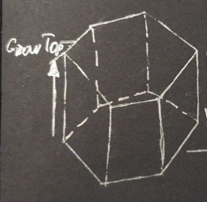
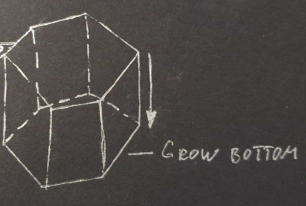
The hexagon side’s divs will be shifted and rotated differently based on the chosen growth direction. During the growth to bottom, we operate with the top side points whose positions are always static, and during the top growth, we also need to consider height changes. More on that in the hexagon-3d module description.
hexagon-3d module
All the logic of this tiny module is encapsulated in the hexagon.service.ts file. Let’s go into its details later.
Except for the abovementioned equations, we also need a mechanism to create hexagons from the top and bottom div rectangles. Let’s use the CSS mechanism for that:
clipPath: 'polygon(0% 25%, 0% 75%, 50% 100%, 100% 75%, 100% 25%, 50% 0%)',
Common parts of top and bottom div styling can be moved into separate objects:
const hexagonStyleCommon = {
    display: 'flex',
    justifyContent: 'center',
    alignItems: 'center',
    position: 'relative',
    width:  width + 'px',
    height: height2D + 'px',
    cursor: 'pointer',
    clipPath: 'polygon(0% 25%, 0% 75%, 50% 100%, 100% 75%, 100% 25%, 50% 0%)',
    background: topBottomColor,
    overflow: 'hidden',
};
The same can be done for the common part of the side’s divs:
const sideStyleCommon = {
    display: 'flex',
    justifyContent: 'center',
    alignItems: 'center',
    position: 'absolute',
    width:  sideLength + 'px',
    height: height + 'px',
    cursor: 'pointer',
    opacity: opacity,
    boxSizing: 'border-box',
    background: sidesColor,
    boxShadow: showShadow ? shadowColor : 'unset',
    transition: showTransition ? 'height 0.5s ease-out' : 'unset',
    overflow: 'hidden',
All hexagon divs will be encapsulated into the main div container with a set of important properties:
container: {
    style: {
        position: 'relative',
        transformStyle: 'preserve-3d',
        transform: `rotateX(${rotateX}deg) rotateZ(${rotateZ}deg)`,
        width: 'fit-content',
    },
.......
transformStyle: ‘preserve-3d’ — tells CSS that we are going to work in the 3D space
transform: `rotateX(${rotateX}deg) rotateZ(${rotateZ}deg)` — provides hexagon rotation on x and z directions based on user inputs
width: fit-content — hexagon uses only space needed for all of its sides
The next sub-objects contain styling for each side, but before looking at it, we need to dive into some math related to how the hexagon’s height will change — to the top or bottom.
Growth to bottom
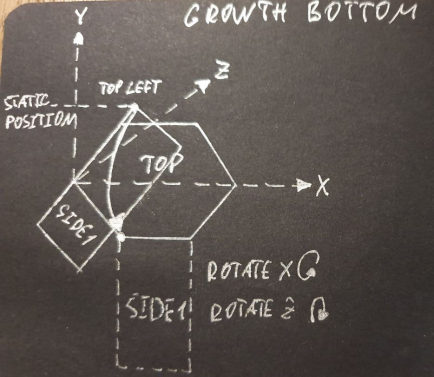
As I mentioned above, to move the hexagon sides from the initial 2D position, we need to shift them into the right position and then rotate for the correct angle around the x and z axes first. Let’s see an example based on side 1 (front side) of the hexagon. To move the front and other sides to the bottom, we operate with its top corner point, which makes this movement a bit easier than movements to the top. The points always have static positions and do not relate to the height, which grows to the bottom of the shape.
Based on this, let’s do our initial shift to get the top left point of the rectangle into the correct position:
left: smallHeight / 2 + 'px'
Then we need to tell CSS that rotation will happen around the top left point:
transformOrigin: 'top left'
And finally, we make a rotation:
transform: 'rotateZ(-30deg) rotateX(-90deg)'
Important: Hexagon is already rotated by 30 degrees by our top styles so we need to account for it in the rotateZ parameter.
The whole object will look like this:
side1: {
    id: 'side1',
    style: {
        ...sideStyleCommon,
        left: smallHeight / 2 + 'px',
        transformOrigin: 'top left',
        transform: 'rotateZ(-30deg) rotateX(-90deg)',
    }
},
You may see all the other bottom transitions in the full code example below:
container: {
        style: {
            position: 'relative',
            transformStyle: 'preserve-3d',
            transform: `rotateX(${rotateX}deg) rotateZ(${rotateZ}deg)`,
            width: 'fit-content',
        },
        top: {
            id: 'top',
            style: {
                ...hexagonStyleCommon,
                zIndex: 2
            }
        },
        side1: {
            id: 'side1',
            style: {
                ...sideStyleCommon,
                left: smallHeight / 2 + 'px',
                transformOrigin: 'top left',
                transform: 'rotateZ(-30deg) rotateX(-90deg)',
            }
        },
        side2: {
            id: 'side2',
            style: {
                ...sideStyleCommon,
                left: (smallHeight / 2 - sideLength) + 'px',
                transformOrigin: 'top right',
                transform: 'rotateZ(30deg) rotateX(-90deg)',
            }
        },
        side3: {
            id: 'side3',
            style: {
                ...sideStyleCommon,
                left: -sideLength + 'px',
                top: (height2D - sideLength) / 2 + sideLength + 'px',
                transformOrigin: 'top right',
                transform: 'rotateZ(90deg) rotateX(-90deg)'
            }
        },
        side4: {
            id: 'side4',
            style: {
                ...sideStyleCommon,
                left: -sideLength + 'px',
                top: (height2D - sideLength) / 2 + 'px',
                transformOrigin: 'top right',
                transform: 'rotateZ(150deg) rotateX(-90deg)'
            }
        },
        side5: {
            id: 'side5',
            style: {
                ...sideStyleCommon,
                left: smallHeight + 'px',
                top: (height2D - sideLength) / 2 + 'px',
                transformOrigin: 'top left',
                transform: 'rotateZ(-150deg) rotateX(-90deg)'
            }
        },
        side6: {
            id: 'side6',
            style: {
                ...sideStyleCommon,
                left: smallHeight + 'px',
                top: (height2D - sideLength) / 2 + sideLength + 'px',
                transformOrigin: 'top left',
                transform: 'rotateZ(-90deg) rotateX(-90deg)'
            }
        },
        bottom: {
            id: 'bottom',
            style: {
                ...hexagonStyleCommon,
                marginTop: -height2D + 'px',
                zIndex: 1,
                transform: `translateZ(${-height}px)`,
                transition: 'transform 0.5s ease-out',
            }
        }
    }
}
Growth to top
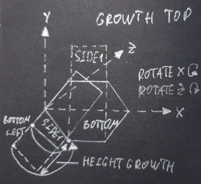
Sides positioning to the top occurs relative to the bottom hexagon. This differs from the bottom because the left bottom point of the rectangle (which is best for proper initial shift) has a dynamic initial position related to face height growth. Therefore, the height parameter should be accounted into the object styling shift.
Based on this, let’s do our initial shift to get the bottom-left point of the rectangle into the correct position:
left: smallHeight / 2 + 'px',
top: (height2D - smallHeight) + 'px'
Then we need to tell the CSS that the rotation will happen around the bottom-left point:
transformOrigin: 'bottom left'
And finally, we create a translation based on height value (here is where height comes into play!) and rotation:
transform: `translateY(${-height + smallHeight}px) rotateZ(-30deg) rotateX(270deg)`,
Tip: marginTop shift can be used instead of the translateY operation. It will have the same effect, and the side will be positioned correctly.
You can see all other top transitions in the full code example below:
container: {
    style: {
        position: 'relative',
        transformStyle: 'preserve-3d',
        transform: `rotateX(${rotateX}deg) rotateZ(${rotateZ}deg)`,
        width: 'fit-content',
    },
    top: {
        id: 'top',
        style: {
            ...hexagonStyleCommon,
            //marginBottom: height2D + 'px',
            zIndex: 2,
            transform: `translateZ(${height}px)`,
            transition: 'transform 0.5s ease-out',
        }
    },
    side1: {
        id: 'side1',
        style: {
            ...sideStyleCommon,
            left: smallHeight / 2 + 'px',
            top: (height2D - smallHeight) + 'px',
            transformOrigin: 'bottom left',
            transform: `translateY(${-height + smallHeight}px) rotateZ(-30deg) rotateX(270deg)`,
        }
    },
    side2: {
        id: 'side2',
        style: {
            ...sideStyleCommon,
            top: (height2D - sideLength) / 2 + sideLength - smallHeight + 'px',
            transformOrigin: 'bottom left',
            transform: `translateY(${-height + smallHeight}px) rotateZ(30deg) rotateX(-90deg)`,
        }
    },
    side3: {
        id: 'side3',
        style: {
            ...sideStyleCommon,
            left: -sideLength + 'px',
            top: (height2D - sideLength) / 2 + sideLength - smallHeight + 'px',
            transformOrigin: 'bottom right',
            transform: ` translateY(${-height + smallHeight}px) rotateZ(90deg) rotateX(-90deg)`
        }
    },
    side4: {
        id: 'side4',
        style: {
            ...sideStyleCommon,
            left: -sideLength + 'px',
            top: (height2D - sideLength) / 2 - smallHeight + 'px',
            transformOrigin: 'bottom right',
            transform: `translateY(${-height + smallHeight}px) rotateZ(150deg) rotateX(-90deg)`
        }
    },
    side5: {
        id: 'side5',
        style: {
            ...sideStyleCommon,
            left: smallHeight + 'px',
            top: (height2D - sideLength) / 2 - smallHeight + 'px',
            transformOrigin: 'bottom left',
            transform: `translateY(${-height + smallHeight}px) rotateZ(-150deg) rotateX(-90deg)`
        }
    },
    side6: {
        id: 'side6',
        style: {
            ...sideStyleCommon,
            left: smallHeight + 'px',
            top: (height2D - sideLength) / 2 - smallHeight + sideLength + 'px',
            transformOrigin: 'bottom left',
            transform: `translateY(${-height + smallHeight}px) rotateZ(-90deg) rotateX(-90deg)`
        }
    },
    bottom: {
        id: 'bottom',
        style: {
            ...hexagonStyleCommon,
            marginTop: - height2D + 'px',
            zIndex: 1,
        }
    }
}
That’s it! After all styles are ready, we may build a hexagon visual representation.
It’s really easy to do by applying styles and ids to the corresponding HTML containers, as you can see below:
<div style={hexagonData.container.style}>
    <div id={hexagonData.container.top.id} style={hexagonData.container.top.style}>
        {topChildren}
    </div>

    <div id={hexagonData.container.side1.id} style={hexagonData.container.side1.style}>
        {side1Children}
    </div>

    <div id={hexagonData.container.side2.id} style={hexagonData.container.side2.style}>
        {side2Children}
    </div>

    <div id={hexagonData.container.side3.id} style={hexagonData.container.side3.style}>
        {side3Children}
    </div>

    <div id={hexagonData.container.side4.id} style={hexagonData.container.side4.style}>
        {side4Children}
    </div>

    <div id={hexagonData.container.side5.id} style={hexagonData.container.side5.style}>
        {side5Children}
    </div>

    <div id={hexagonData.container.side6.id} style={hexagonData.container.side6.style}>
        {side6Children}
    </div>

    <div id={hexagonData.container.bottom.id} style={hexagonData.container.bottom.style}>
        {bottomChildren}
    </div>
`</div>
But, if you are developing using React, you can create a tiny parametrized component that will make your life even easier ;).
hexagon-3d-react module
All logic of this tiny module is encapsulated in the Hexagon3D.tsx file. Let’s look at in detail:
const Hexagon3D = (props: IHexagonProps & IHexagonChildrensProps): JSX.Element => {
  const {
      width,
      height,
      rotateZ,
      rotateX,
      growTop,
      showShadow,
      shadowColor,
      topBottomColor,
      sidesColor,
      opacity,
      showTransition,
      topChildren,
      bottomChildren,
      side1Children,
      side2Children,
      side3Children,
      side4Children,
      side5Children,
      side6Children,
  } = props;
  const hexagonData = hexagon3D({
      width, height, rotateZ, rotateX, growTop, showShadow, shadowColor, topBottomColor, sidesColor, opacity, showTransition});

  return (<div style={hexagonData.container.style as CSSProperties}>
      <div id={hexagonData.container.top.id} style={hexagonData.container.top.style as CSSProperties}>
          {topChildren}
      </div>

      <div id={hexagonData.container.side1.id} style={hexagonData.container.side1.style as CSSProperties}>
          {side1Children}
      </div>

      <div id={hexagonData.container.side2.id} style={hexagonData.container.side2.style as CSSProperties}>
          {side2Children}
      </div>

      <div id={hexagonData.container.side3.id} style={hexagonData.container.side3.style as CSSProperties}>
          {side3Children}
      </div>

      <div id={hexagonData.container.side4.id} style={hexagonData.container.side4.style as CSSProperties}>
          {side4Children}
      </div>

      <div id={hexagonData.container.side5.id} style={hexagonData.container.side5.style as CSSProperties}>
          {side5Children}
      </div>

      <div id={hexagonData.container.side6.id} style={hexagonData.container.side6.style as CSSProperties}>
          {side6Children}
      </div>

      <div id={hexagonData.container.bottom.id} style={hexagonData.container.bottom.style as CSSProperties}>
          {bottomChildren}
      </div>
  </div>)
};
As you may see, it’s a very simple React component that gets all hexagon-3d parameters as inputs and draws a nice hexagon on your webpage.
Important: you may find the list of all hexagon-3d and hexagon-3d-react modules on their corresponding NPM pages.
Conclusion
That’s it! We have done our fancy hexagon builder module. I hope you enjoy playing with it and build many nice interactive applications based on this shape.
If you liked this article, feel free to leave comments and questions. Also, I will be happy to see how you used hexagon-3d in the comments. Drop your links!
NPM packages: hexagon-3d and hexagon-3d-react
Enjoy!
Entertaining Web Geometry: Building an Interactive 3D CSS Hexagon was originally published in Better Programming on Medium, where people are continuing the conversation by highlighting and responding to this story.