
Protocol-oriented programming is one of the most powerful and flexible tools for competent composition and distribution of responsibility in Swift. In one of the previous articles, protocol-oriented programming was used to manage the state and build a safe sequence of state transitions without additional checks. If you have not read the previous article, then it is recommended to read as material that will show one of the ways to use this wonderful approach.
In this article, we’ll explore another way to use protocol-oriented programming. As a bonus — we’ll write our extension for programming UI components in UIKit that mimics the SwiftUI experience.
What is the task before us? As we all know, all graphical components in UIKit are direct descendants of UIView, each with its own unique properties. A protocol-oriented approach will help us to endow each of the heirs with their own unique properties while making it possible to combine these properties in case we want to use the properties of the parent and the properties of the child. In addition to the protocol-oriented approach, we will also use the Decorator design pattern to bring the SwiftUI declarative syntax experience to UIKit.
Let’s start with the simplest. Select several basic UI classes with which we will start:
- UIView — all graphical components are inherited from it
- UIControl — all UIButton, UISegmentedControl and so on are inherited from it
- Final UI components like UILabel, UITextField, and so on
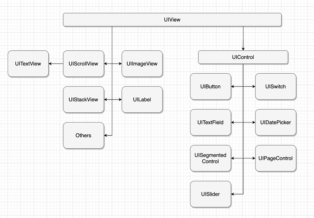
The inheritance diagram can be seen below:
Let’s start our task by creating an interface:
protocol Stylable {}
This protocol is the basis for all subsequent extensions for our case. Since all graphical components somehow inherit from UIView to cover all components — it is enough to extend UIView with this protocol:
extension UIView: Stylable {}
Some of the most used properties for customizing a UIView are cornerRadius, backgroundColor, clipsToBounds, contentMode, isHidden. Moreover, these properties are often used not only to configure the UIView, but also for its descendants.
Let’s extend the possibilities of Stylable for all UIView classes and their descendants:
extension Stylable where Self: UIView {
    @discardableResult
    func cornerRadius(_ value: CGFloat) -> Self {
        self.layer.cornerRadius = value

        return self
    }

    @discardableResult
    func backgroundColor(_ value: UIColor) -> Self {
        self.backgroundColor = value

        return self
    }

    @discardableResult
    func clipsToBounds(_ value: Bool) -> Self {
        self.clipsToBounds = value

        return self
    }

    @discardableResult
    func contentMode(_ value: UIView.ContentMode) -> Self {
        self.contentMode = value

        return self
    }

    @discardableResult
    func isHidden(_ value: Bool) -> Self {
        self.isHidden = value

        return self
    }
}
Let’s check what this extension gave us:
let customView = UIView()
    .backgroundColor(.red)
    .clipsToBounds(true)
    .cornerRadius(20)

let customButton = UIButton()
    .backgroundColor(.red)
    .clipsToBounds(true)
    .cornerRadius(20)

let segmentedControl = UISegmentedControl(items: ["One", "Two"])
    .backgroundColor(.red)
    .clipsToBounds(true)
    .cornerRadius(20)

let scrollView = UIScrollView()
    .backgroundColor(.red)
    .clipsToBounds(true)
    .cornerRadius(20)

let textField = UITextField()
    .backgroundColor(.red)
    .clipsToBounds(true)
    .cornerRadius(20)
As we can see, thanks to the extension, we can declaratively change properties not only for UIView but also for its descendants.
Let’s move on to configuring the UIControl. For all of its descendants, one of the most used customizable things is tap, properties — isEnabled, tintColor, isUserInteractionEnabled.
Let’s extend the possibilities of Stylable for all UIControl classes and their descendants:
extension Stylable where Self: UIControl {
    @discardableResult
    func action(_ value: (() -> Void)?, event: UIControl.Event = .touchUpInside) -> Self {
        let identifier = UIAction.Identifier(String(describing: event.rawValue))
        let action = UIAction(identifier: identifier) { _ in
            value?()
        }

        self.removeAction(identifiedBy: identifier, for: event)
        self.addAction(action, for: event)

        return self
    }

    @discardableResult
    func secondAction(_ value: ((Bool) -> Void)?, controlEvent: UIControl.Event = .valueChanged) -> Self {
        let identifier = UIAction.Identifier(String(describing: controlEvent.rawValue))
        let action = UIAction(identifier: identifier) { item in
            guard let control = item.sender as? UIControl else {
                return
            }
            value?(!control.isTracking)
        }

        self.removeAction(identifiedBy: identifier, for: controlEvent)
        self.addAction(action, for: controlEvent)

        return self
    }

    @discardableResult
    func isEnabled(_ value: Bool) -> Self {
        self.isEnabled = value

        return self
    }

    @discardableResult
    func isUserInteractionEnabled(_ value: Bool) -> Self {
        self.isUserInteractionEnabled = value

        return self
    }

    @discardableResult
    func tintColor(_ value: UIColor) -> Self {
        self.tintColor = value

        return self
    }
}
After the Stylable extension for UIControl, an additional customization option became available for all its descendants:
let customButton = UIButton()
    .backgroundColor(.red)
    .clipsToBounds(true)
    .cornerRadius(20)
    .tintColor(.red)
    .action {
       print(#function)
    }
    .isEnabled(true)
    .isUserInteractionEnabled(true)


let segmentedControl = UISegmentedControl(items: ["One", "Two"])
    .backgroundColor(.red)
    .clipsToBounds(true)
    .cornerRadius(20)
    .tintColor(.red)
    .action {
       print(#function)
    }
    .isEnabled(true)
    .isUserInteractionEnabled(true)
It is worth noting that when calling the action method using a class method, you should initialize this component lazily to ensure that the class (self) is initialized before the component is initialized.
lazy var customButton = UIButton()
    .backgroundColor(.red)
    .clipsToBounds(true)
    .cornerRadius(20)
    .tintColor(.red)
    .action { [weak self] in
         self?.actionTest()
    }
    .isEnabled(true)
    .isUserInteractionEnabled(true)

private func actionTest() {
    print(#function)
}
Let’s also extend UITextField with some of the most popular custom properties:
extension Stylable where Self: UITextField {
    @discardableResult
    func text(_ value: String?) -> Self {
        self.text = value

        return self
    }

    @discardableResult
    func font(_ value: UIFont) -> Self {
        self.font = value

        return self
    }

    @discardableResult
    func textAlignment(_ value: NSTextAlignment) -> Self {
        self.textAlignment = value

        return self
    }

    @discardableResult
    func textColor(_ value: UIColor) -> Self {
        self.textColor = value

        return self
    }

    @discardableResult
    func capitalizationType(_ value: UITextAutocapitalizationType) -> Self {
        self.autocapitalizationType = value

        return self
    }

    @discardableResult
    func keyboardType(_ value: UIKeyboardType) -> Self {
        self.keyboardType = value

        return self
    }

    @discardableResult
    func isSecureTextEntry(_ value: Bool) -> Self {
        self.isSecureTextEntry = value

        return self
    }

    @discardableResult
    func autocorrectionType(_ value: UITextAutocorrectionType) -> Self {
        self.autocorrectionType = value

        return self
    }

    @discardableResult
    func contentType(_ value: UITextContentType?) -> Self {
        self.textContentType = value

        return self
    }

    @discardableResult
    func clearButtonMode(_ value: UITextField.ViewMode) -> Self {
        self.clearButtonMode = value

        return self
    }

    @discardableResult
    func placeholder(_ value: String?) -> Self {
        self.placeholder = value

        return self
    }

    @discardableResult
    func returnKeyType(_ value: UIReturnKeyType) -> Self {
        self.returnKeyType = value

        return self
    }

    @discardableResult
    func delegate(_ value: UITextFieldDelegate) -> Self {
        self.delegate = value

        return self
    }

    @discardableResult
    func atributedPlaceholder(
        _ value: String,
        textColor: UIColor,
        textFont: UIFont
    ) -> Self {
        let attributedString = NSAttributedString(
            string: value,
            attributes: [
                NSAttributedString.Key.foregroundColor: textColor,
                NSAttributedString.Key.font: textFont
            ]
        )

        self.attributedPlaceholder = attributedString

        return self
    }
}
Thanks to this extension, now customizing UITextField has become even easier. To customize the GUI, the methods of its parents are available, as well as its own methods:
lazy var textField = UITextField()
     .placeholder("Placeholder")
     .textColor(.red)
     .text("Text")
     .contentType(.URL)
     .autocorrectionType(.yes)
     .font(.boldSystemFont(ofSize: 12))
     .delegate(self)
It’s worth noting that, similar to capturing self in the UIControl’s action method, assigning a delegate also requires textField to be lazy-initialized.
By analogy, the rest of the graphical components are expanded with properties that will be used for customization.
As a bonus for my readers, I’ve compiled some of the most requested properties in this repository. You need to copy the files to your project; they are ready to use.
Don’t hesitate to contact me on Twitter if you have any questions. Also, you can always buy me a coffee.
Creating and Modifying UIKit Components Like in SwiftUI was originally published in Better Programming on Medium, where people are continuing the conversation by highlighting and responding to this story.