An analysis of a car-lite lifestyle in Los Angeles
Introduction
This project attempts to improve the process of moving to a new city and choosing a new rental accommodation. I utilize predictive site analysis techniques, scrape rental real estate data, and create an organizational system to make data-oriented decisions for my relocation.
This project is an extension of my skillset acquired from Columbia University GSAPP. More projects like this can be found here.
Abstract
This project proposes streamlining and strengthening the relocation decision-making process with spatial data and analytical insights. This proposal does not offer a perfect urban area, but an attempt for better will always be top of mind. I led this project believing that this sprawled city, Los Angeles, has pockets of urban characteristics within our price range. This project aims to find housing accommodations that are walkable in my time off and bikeable to my place of work. This methodology for analysis attempts to save the user time and resources when selecting a new place to live.
Problem: My household has become accustomed to urban areas where amenity density allows for a walkable/bikeable lifestyle.
Barrier: Los Angeles is a notorious car-centric city. Furthermore, we need more time and funds to analyze potential neighborhoods thoroughly for aptness conducive to our preferred lifestyle.
Solution: Utilizing spatial data (LA open data), network analysis, and a custom-weighted decision matrix, I can remotely sense an urban environment and make a data-oriented decision on which areas I should relocate to in Los Angeles.
This analysis is part one of two, a proof of concept. This first part utilizes a remote sensing analysis, while the second will confirm the study through field research.
LA Analysis

The results
This project allocated an estimated 50 hours and surfaced an initial 201 units, a 30% reduction. A secondary filtering process reduced the results by 70%.* I did not begin this project expecting the analysis to be a quick turnaround, but we can filter nearly half the Zillow results in a little over one work week. With the spatialized data, we can count how many units are apt for my lifestyle and within my price range.
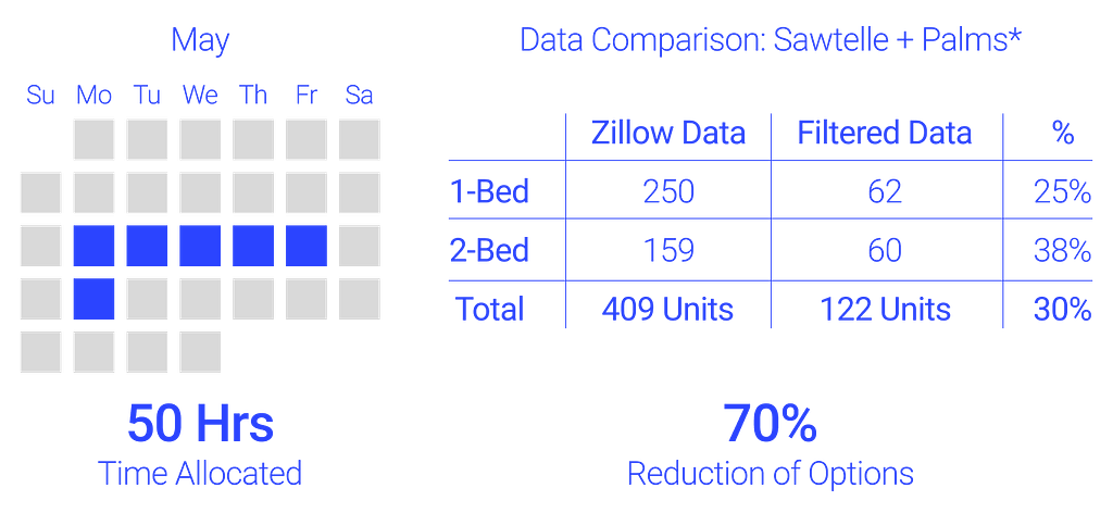

Albeit in neighborhoods I was unaware of, the Sawtelle and Palms neighborhood has surfaced as having the most available options. Within my price range and bedroom count, 122 suitable units are within these two neighborhoods. This is a 70% reduction from the initial Zillow options. Both areas appear apt for my lifestyle with amenity density, metro stations, and supermarkets.
The workflow
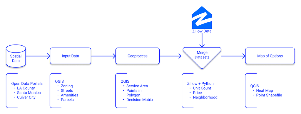
This workflow is the meat of this proposal. At a high level, this approach can be replicated for most (if not all) urban areas, data allowing. I utilize spatial data, spatial analytics, web scraping, and data visualization techniques in this workflow.
The most challenging component is finding quality data to utilize as our foundation. Sourcing data for your needs can be time-consuming, but the processing components are quick once acquired. None of this could be done without open spatial datasets from public agencies and crowd-sourced. Furthermore, open-source software like QGIS, Figma, and Python are effective tools to push these thoughts forward.
How Does it Work?
As prefaced earlier, this article is part one of two. Part one is focused on remote sensing; part two will be field research to prove or disprove part one.
I used QGIS, Python, Figma, LA Open Data, Open Street Maps, and Zillow rental data to remotely sense a series of neighborhoods near my future place of work. I implement this methodology to find rental accommodations that are walkable in my time away from work and bikeable from my place of work. The following sections will outline my detailed methods for this project.
Setting up the environment
Before any analysis can happen in QGIS, I need spatial data to create a base map for geoprocessing. This base map, particularly the street network, is crucial for performing service area analysis and another spatial syntax. This project expands beyond the LA County data portals and into the open data portals of Santa Monica and Culver City.
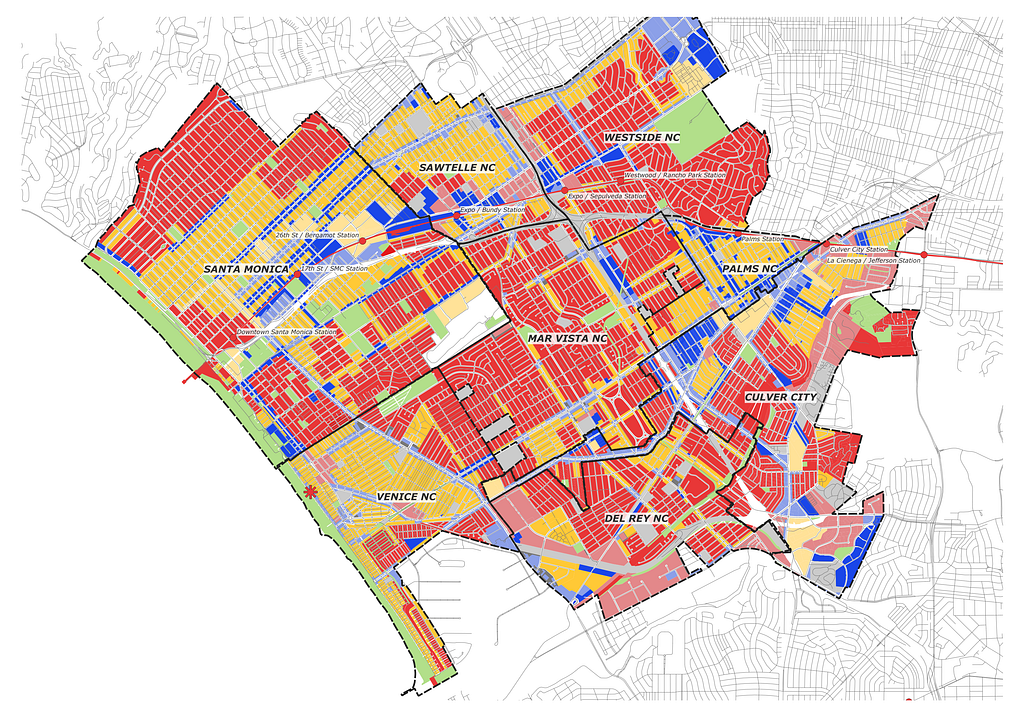
The various city agencies’ portals and labeling protocols were one snag. Special district overlays within each city have specific acronyms/designators for their zoning regulation but similar urban characteristics. I decided to synthesize zoning designation according to my preferred density; the denser, the better.

Identifying lifestyle constants and criteria
We ground the process in a series of constants and criteria. The constants are spatially fixed items in the location we are moving. In my case, the only true constant I used was my place of work.

The criteria categories are more subjective and personal. My household surveyed our lifestyles and how we like to spend outside work hours. We distilled that survey into various amenity categories for measurement. Amenities and activities are categorized into syntax that can be queried using Open Street Maps feature list.

Service area analysis
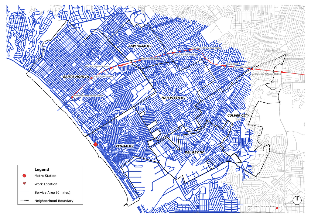
Next, I calculate a service area analysis from a point within a fixed distance originating from the constants. For this project, the service area is within a six-mile network range from my place of work. I can be comfortable biking up to and from work daily within this range. A shorter distance would be ideal but also limit the rental and amenity options.

Counting amenities in a walkable radius
With the service area defined, the next step is understanding where I might want to spend my time away from work. I analyze amenities within the six-mile service area network and their location. Next, I geolocate amenities in the virtual environment using the plugin QuickOSM in QGIS. This plugin queries amenity locations from Open Street Maps into point shapefiles and preps my map for geoprocessing.
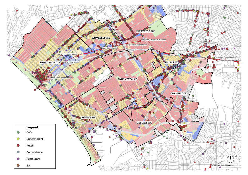
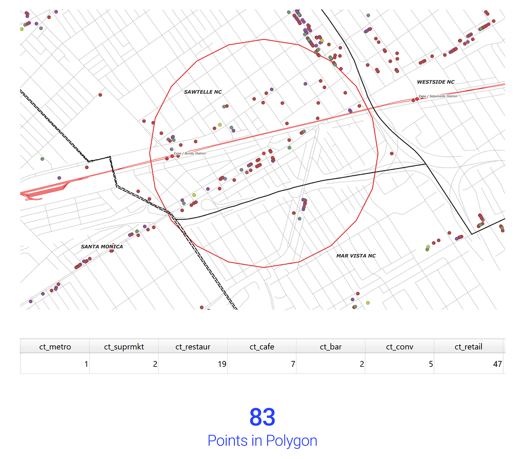
Once these amenity points are spatially located, I want to know their relationship within the service area analysis. First, we need to extract the node points from the service area into multi-line data for processing. Then increasing each node point to a 0.5 radius, using the buffer tool, I simulate a walkable spatial radius. Then I can run the points in polygon analysis to understand which amenities are within the network analysis. This geoprocessing outputs a sum as a floating object which I can use to further process and analyze.
Weighted decision matrix
Once we have the sum of each amenity quantity within 0.5 miles of each node point, we can begin to calculate which nodes, and thus areas, are most apt for my household’s lifestyle. Before processing the data in a matrix, I cleaned the map by reprocessing the 0.5 radius node points into centroids. This analysis was done in the data table by creating new field calculations with the following equation: ct_amenity * weight = wt_amenity. Once we have weight-adjusted amenity counts, we total each field for wt_total, then visualize the analysis below.

To visualize this process scaled over the entire service area, I use a heatmap under the symbology tab.

Zillow scraping
The heatmap is great, but I wanted to visualize both the heatmap and rental availability concurrently. To process rental availability, we turn to Zillow. After selecting pricing, bedroom, and neighborhood filters, I scraped the Zillow website to generate a spatial dataset for my virtual environment.


To do this, I found an online tutorial that formatted the scraped data into JSON. I added the code block below to make it useful for my map. This section directs output to my Google Drive and reformats the JSON into a CSV for our shapefile. Each CSV has a longitude and latitude field to import into QGIS and spatialize the data.
##turn DataFrame into csv
# mount drive
drive.mount("/content/drive", force_remount=False)

# data location
file_path = "/content/drive/My Drive/SUMMER PROJECTS/LA Analysis/Data/zillow/2Bed_zillow_wshrdryr_dataset.csv"

#export json to csv
df_rent_listings.to_csv(file_path, index=False)
Conclusion
As stated, this proposal does not offer a perfect urban area, but an attempt for better will always be top of mind.
Problems and limitations
Notice I excluded many urban features that others may want to quantify. For instance, I did not calculate the linear square feed of bike paths within a service area. I chose to exclude bike paths primarily because I couldn’t source a complete LA County dataset. Finding datasets is by far the more time-consuming phase of this process. Features I chose to exclude, but others may want to quantify and their metric; bike paths (lf), open space (sf), road width (ft), and population (integer).
Another limitation is the area I surveyed. Running the points in polygon process took significant computing power. This process would require significantly more CPU and RAM if I had multiple constants spread across the metropolitan.
Final Thoughts
This summer, I will be moving between NYC and LA. This project aims to find housing accommodations that are walkable in my time off and bikeable to my place of work. This urban analysis proves helpful and saves my household time searching and hunting for rental opportunities.
This short project proved extremely exciting as it surfaced the neighborhoods of Sawtelle and Palms as highly desirable location for my lifestyle. This project was a proof of concept attempt to streamline the decision-making process when relocating cities. Hopefully, with this methodology + dataset created, more analysis can be overlaid and facilitated for future relocations.
I am a design technologist working in the architecture industry. I hope this methodology and approach proves useful to those who are interested.
Can I Walk There?— Network Analysis for Los Angeles was originally published in Better Programming on Medium, where people are continuing the conversation by highlighting and responding to this story.